

Interior Design Basics for Beginners
Interior design might seem intimidating at first, but it doesn’t have to be. Whether you’re furnishing your first apartment or finally giving your living room a makeover, understanding a few essential terms can go a long way. These core concepts help you make smarter decisions about color, furniture, layout, and more—so your home feels intentional, not accidental.
This guide to interior design basics is created for beginners who want to build confidence and style as they design their own space. From understanding balance to building a cohesive color palette, these terms will give you a solid foundation for any decorating project. Once you grasp these fundamentals, you’ll be able to spot what works (and what doesn’t) in a room—and make your space feel like you.
Cohesive Design
Cohesive design is all about creating a sense of unity throughout a space. It means that all the elements in a room—furniture, color, texture, decor—work together in a way that feels intentional and harmonious. Even if you mix styles, such as modern furniture with vintage accents, a cohesive design ensures the space doesn’t feel random or chaotic.
One of the easiest ways to achieve cohesive design is through repetition. Repeating similar colors, shapes, or materials throughout the room ties everything together visually. For example, if you choose brass hardware for your lamps, you might repeat that finish on curtain rods or picture frames.
Cohesion doesn’t mean everything has to match perfectly. Too much matching can make a room feel flat. Instead, focus on a consistent vibe or theme that runs throughout the space. As you learn interior design basics, understanding cohesion will help your rooms look polished and professionally designed.

Scale
Scale refers to the size of objects in relation to the space and to one another. It’s one of the most important—yet most overlooked—interior design basics. Getting scale right ensures that your furniture and decor feel balanced, not too big or too small for the room they’re in.
For example, a large sectional might overwhelm a small living room, while a tiny rug under a big dining table can make the room feel disjointed. Likewise, a tall ceiling with low-profile furniture might feel oddly empty or unfinished. The goal is to match the size and visual weight of your furnishings to the room’s proportions.
When you understand scale, you can avoid costly mistakes like buying furniture that doesn’t fit or art that gets lost on a big wall. Always measure your space—and the items you’re considering—and be mindful of how things relate to one another in size and presence.

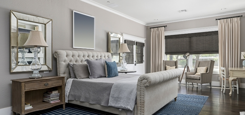
Balance
Balance in interior design means distributing visual weight evenly across a room so that no area feels too heavy or too empty. There are three types of balance to consider: symmetrical, asymmetrical, and radial.
Symmetrical balance is when items are mirrored on either side of a central point—like matching nightstands and lamps on both sides of a bed. It feels formal, calm, and classic. Asymmetrical balance, on the other hand, involves different items that carry the same visual weight, like a floor lamp on one side of a sofa and a plant or a stack of books on the other. This version is more relaxed and modern. Radial balance uses a central point with elements radiating around it—like chairs arranged around a round table.
Learning to balance a room is one of the key interior design basics. When done well, it creates harmony and helps your eyes move comfortably throughout the space without feeling overwhelmed or unsettled.

Color Palette
Your color palette is the group of colors you choose to repeat and build around in a room. It’s a foundational element of interior design basics because it influences mood, energy, and cohesion. A well-chosen color palette helps guide decisions for furniture, textiles, paint, and even small accessories.
Start with 2–3 main colors and add one or two accent shades. A typical formula might include a dominant neutral (like white, beige, or gray), a secondary color (like navy or green), and a pop of an accent color (like mustard or coral). Tools like paint chips, fabric swatches, or even inspiration photos can help you visualize how your colors will look together.
Consistency is key. You don’t need to use all your colors in every single corner, but repeating them throughout the room—in artwork, pillows, or rugs—makes everything feel cohesive. Choosing and sticking to a color palette is one of the simplest ways to bring professionalism into your decorating process.

Focal Point
A focal point is the first thing your eyes are drawn to when you enter a room. It anchors the space and gives you a place to build your design around. In living rooms, this might be a fireplace or a large piece of art; in bedrooms, it’s often the headboard or bed wall.
A strong focal point adds structure and purpose to a room. Without it, spaces can feel visually scattered or incomplete. Once you have chosen your focal point, arrange other items—such as lighting, furniture, or decor—to support and enhance it. For example, if you’re using a statement mirror as your focal point, flank it with sconces or coordinate colors to make it pop.
Mastering focal points is a valuable part of interior design basics. It helps you avoid over-decorating every wall and gives your space a more curated, styled appearance.

Texture
Texture refers to how surfaces feel (or appear to feel). It adds depth, contrast, and interest to a room. You can incorporate texture through fabrics (like velvet, linen, or boucle), hard materials (like wood, stone, or metal), and finishes (like matte vs. glossy).
Even a neutral-toned room can feel rich and inviting when textures are layered thoughtfully. Think about the softness of a throw blanket, the roughness of a jute rug, the shine of a ceramic vase, or the grain of a wooden coffee table. When you mix textures, you engage multiple senses—not just sight, but touch.
Texture is often what separates an average room from one that feels cozy and lived-in. As you build your confidence with interior design basics, don’t overlook this powerful design tool.

Negative Space
Negative space is the “empty” or open space around and between objects in a room. While it might sound like a lack of design, it’s a vital part of interior design basics. Negative space allows your eyes to rest and helps highlight the items that are there.
Think of it like punctuation in writing—without spaces or pauses, everything feels jumbled and hard to follow. In design, too much clutter or filling every wall and corner can make a room feel chaotic. Strategic negative space brings balance and a sense of calm.
Leaving space around furniture, spacing art appropriately on walls, and resisting the urge to over-accessorize are all effective ways to utilize negative space. When done well, it makes a room feel airy, intentional, and elevated.

Conclusion
Learning interior design basics doesn’t mean memorizing a long list of rules—it means understanding a few key principles that can guide your decisions and help you trust your instincts. Terms like cohesive design, scale, and color palette aren’t just buzzwords—they’re practical tools that shape the way a space feels.
As you begin to decorate your own home, revisit these concepts often. Use them as a checklist or filter when making decisions about what to buy, where to place it, and how to tie everything together. Interior design is a creative journey, and once you grasp the basics, you’ll find your confidence—and your style—starting to grow.
That’s all for this post on interior design basics. If you enjoyed it, please share it with a friend and follow Dianne Decor on YouTube, Pinterest, and Instagram.
Here are a few more posts you may like:
- 8 Trendy & Innovative Bed Frame Styles
- 10 Top-Rated Furniture Stores on Amazon
- 5 Excellent Grown Woman Bedroom Ideas
Don’t forget to join the mailing list before you go. I’ll send you a copy of my weekly newsletter filled with my latest blog posts, decorating inspiration, and the best deals on home decor.


