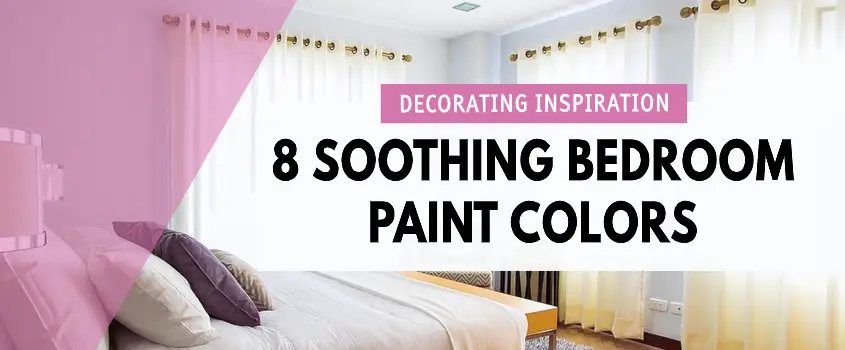
8 Soothing Bedroom Paint Colors
FTC Disclosure - This post contains affiliate links and I will be compensated if you make a purchase after clicking on my links.
*Item received for free for promotional consideration or a sponsored link.
A calming and soothing bedroom environment has become more important than ever. Second, only to minimalizing clutter, choosing a soothing bedroom paint color is key to creating a retreat within your home.
With so many other spaces in our home being used as multi-functional spaces, there is little retreat to be found from the hustle and bustle of the day.
Here are 8 soothing bedroom paint colors to help you create a relaxing retreat within your home.
Why Color In Your Bedroom Is Important
Color is important anywhere in your home, but especially in your bedroom. Your bedroom is a space in which you are trying to assist your body to switch gears from an active to a resting state. Because of this, the things you see, hear, and smell become incredibly important in this space.
There’s a great post on color psychology from verywellmind.com that dives into the possible effects a variety of colors will have on you. For this post, we’ll focus on colors that are most likely to evoke a feeling of calm and relaxation.
Suggested Post: Timeless Room Ideas: Master Bedroom Decorating and the 5 Senses

Which Colors Are Best For The Bedroom
Blue, green, white, gray, and brown color families are the best for the bedroom. Blue brings on a feeling of relaxation, while green is restful and soothing. White will give you a sense of refresh and renewal while gray will give you a neutral stable baseline of emotion. Brown color families evoke a feeling of warmth, comfort, and security.

8 Soothing Bedroom Paint Colors
Below is a list of 8 incredibly soothing bedroom paint colors. I’ll link the title of each color so that you can see where to purchase these exact shades. For this list, I wanted to provide a variety of blue, green, gray, and brown tones.
That being said, color is highly subjective and what one person may find soothing, another may not. This means that bedroom paint colors should be a joint decision if you share a bedroom with another person.
Be sure to make decisions like a change in paint color together. The goal should be that all occupants of a bedroom are able to feel a sense of calm and relaxation when they’re ready to take a rest.
So, without further adieu, here are 8 soothing bedroom paint colors that I think you’ll love.
1. Krypton
Krypton from Sherwin Williams is a gorgeous blueish gray shade. It’s light and airy and can be paired up with darker furniture and decorative accents for a deeper look, or lighter decor for a light and bright room.
This color pairs well with tan, beige, and brown.

2. Cotton Sheets
Kid’s rooms are fun to experiment with, however, keeping the base a calming shade will play an important role when it’s time for playtime to end. In this image from Behr.com we see a light beige shade called cotton sheets featured on the upper half of the wall.
It’s a great neutral tone and pairs well with the darker brown town on the bottom third of the wall. A deep blue or green share would also look great paired with this color.

3. Cyberspace
Cyberspace is a deep gray that seems devoid of emotion. This makes it a fantastic soothing bedroom paint color choice. I like the fact that it’s light enough to avoid that feeling of the walls are closing in on you.
The bedroom below has a lot of great natural light streaming through the window. However, if you don’t have much sunlight coming through your windows you may want to opt for a lighter color or just use this one accent wall.

4. Oakmoss
Here’s another darker color from Sherwin Williams that is absolutely gorgeous. This Oakmoss shade is nature-inspired and brings a feeling of calm and tranquility to this space.
I love the whole eclectic vibe of this room with the wood tones, tasseled lighting fixture, and all of the texture throughout the space.
This color is the perfect complement to any wood tone, so if you have a lot of wood furniture in your room, consider a shade like this.

5. Guilford Green
Here’s a fun fact, Guilford Green is a part of Benjamin Moore’s Historic Color collection. It’s one of 191 shades that were inspired by some of America’s historic landmarks.
This shade of green is hard to describe. It’s light but not bright. It’s green-leaning towards beige, and the feeling I get from looking at this shade is much like the way I feel about gray.
It doesn’t spark emotion one way or another. That neutrality is soothing and calming to the mind. It’s forgettable in the best way.
I would pair this with deep brown toned furniture and maybe some deeper shades of green.

6. Acacia Haze
This is one of my favorite colors on this list. It’s a green that falls in between Oakmoss and Guilford Green for me. It’s a mid-tone shade that’s dark enough to make white and cream pop out against it in a wonderful way.
The color combo shown in the bedroom below is perfect. The white, cream, and grayish brown colors splashed about in this room are gorgeous.

7. Rojo Dust
The shade Rojo Dust is unique. It’s not quite red or pink or brown. It sits somewhere in between that trio of colors. For me, I see slightly more brown. I suspect this is why I find it to be a soothing shade.
However, if you’re a person who sees it more as red or pink, you may not feel the same way. I think this is a bit of a polarizing shade. Let me know in the comments below if you would paint your room this color.

8. Fawn Brindle
Last but not least is Fawn Brindle from Sherwin Williams. This is a really versatile color that works well as a backdrop to a number of home decor styles. You can pair this with white for a modern farmhouse look. Or, pair it with mustard yellow and terracotta for an eclectic style interior.
It can be used as a soothing bedroom paint color, or look just as lovely in a living room or dining room.
This shade is a win-win all around in my opinion.

Conclusion
I hope you found this list helpful. If you have a bedroom paint color that you absolutely love, please leave it in the comments below. For more from Dianne Decor, follow me on Bloglovin’, Instagram, Pinterest, and Twitter.
To have my latest posts delivered directly to your inbox, join the mailing list before you go. I’ll send you a copy of my weekly newsletter filled with weekend reads, decorating inspiration, and the latest deals on home decor.
You can check out past issues in the newsletter archive here.